Viewing entries tagged
graphic design

Share

Steinweiss on Steinweiss

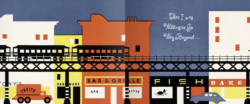
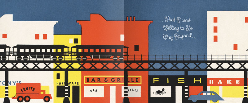
When I originally did the title lettering for "Alex Steinweiss: The Inventor of the Modern Album Cover" I hadn't yet designed "Steinweiss Script". In fact it was designing this headline that spurred me to do that typeface design. In retrospect there were many interior headlines and other lines of copy for the book that Josh Baker, AD at Taschen, would have liked to have had set in a new Steinweiss Script font. But they had to settle for what was available at that time, which was one of several different digitized versions of what Alex Steinweiss had originally designed for Photo-Lettering. Now Taschen has released their more moderately priced trade edition of this incredible book—and just in time for this release I was able to reset all their headlines and other copy the way we had originally wanted to—in Steinweiss Script:

Above: Before and After Details from the older and newer editions

Below: You can Look Inside the earlier edition...

...or Look Inside the newer version:

Our intention was that the newer version, with everything reset in Steinweiss Script, would feel closer to what Mr. Steinweiss would have done had he been able to apply his scrawl to these pages.

Just a reminder: Steinweiss Script is available for purchase on MyFonts, Veer, FontShop and YouWorkForThem. To learn more about these fonts, read Steven Heller's Imprint article or MyFonts' Creative Characters for January.

Share

Share

It Began in NoHo: Thank You Art Institute!

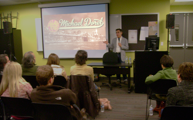
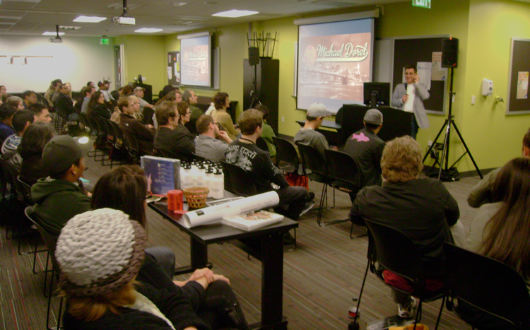
Last Friday I gave a talk to a capacity crowd at Art Institute of California – Hollywood. A big "THANK YOU" goes out to John Judy, the Academic Director of Graphic Design and Foundation Studies who planned the evening, and set it all up. I tailored my hour-long talk "It Began In Brooklyn" to what I expected would be a mostly student crowd, but many professionals showed up as well. The school opened up their space to a triple–wide room with three screens and three projectors—an unexpected layout which actually worked quite well. Afterwards we had a Q&A where I tried to answer some great questions from students and professionals. We then raffled off a Wacom tablet, a 1 year subscription to Lynda.com, several signed event posters and a CD of the complete Alphabet Soup Font Collection. I must say that it was really gratifying to see the high interest level displayed by many of the students. All in all it was a great evening. I hope everyone enjoyed it as much as I did! Below, a few photos taken by John Judy after the talk.

Share

Share

MyFonts Creative Characters Newsletter

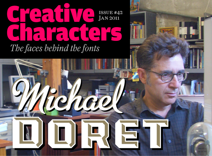
I feel very honored that MyFonts chose me as the subject of their January 2011 Creative Characters Newsletter. It took the form of an interview, and in it I've answered a lot of questions, probably at greater length than I have in the past. So if you're curious as to what makes me tick, set aside 10 or 15 minutes and read this interview. If you still have any questions, I'll entertain them here!

All you information hounds can also check out the new "Interviews & Resources" page I've just set up on my website, where I've posted other interviews, articles, PDFs, etc., that I've done in the past. Now go write that report!

Share

Share

Art Imitates Life...Imitates Art (Canter's Truck #3 of 3)

SignQuest was the company that RoadStoves had recommended to "wrap" the truck with the graphics I had designed. They produce large scale banners and signs as well as vehicle wraps. One interesting project they were recently involved with was wrapping the Hollywood Sign for the "Save the Peak" campaign. The goal of this campaign is to raise funds to purchase the land adjacent to the Hollywood sign. Hopefully this would prevent commercial development that would permanently mar the view of the iconic sign and the world-famous silhouette of the hills that frame it. Wrapping the Hollywood Sign was a complex project, but wrapping a truck properly is also difficult and time consuming. Getting it right means placing the many strips of 3M Controltac vinyl film in the right positions:

Louie Navarro is seen above carefully positioning the vinyl on the service side (the side from which the food will be served) of the truck. He must carefully gauge where to position the film at the back of the truck so that the graphics end up at the right spot by the time they reach the front.

Over on the driver's side, Louie positions the main graphics. There are many ins and outs to the truck surface, and the Controltac film is flexible enough to conform to them all, ending up looking very much as if it had been painted on. It's pretty amazing.

Here's one photo of the driver's side. I'll post more photos from different angles as they become available.

In the meantime the  Canter's Truck has begun cruising the streets of LA with Bonnie Bloomgarden at the helm. To find out when they're going to be in your area you can follow them on Twitter.

Photo: Adam Stein

Share

Share

Coming Soon . . . Canter’s Truck Post #3 of 3

Due to my inability of being able to get good photographs of the completed Canter's truck, I'm holding up posting the final chapter in this saga. I hope to be able to get some better shots by the end of this week. If not I'll just post what I've got.Thanks for your patience!

Above: Careful placement of my credit below the trash receptacle.

Share

Share

Art Imitates Life...Imitates Art (Canter's Truck #2 of 3)

Although most of the food trucks are similar in appearance, many contain details that slightly alter some of their proportions. So it became necessary for me to visit the Road Stoves truck depot and to take pictures of the truck that would be closest to the one that Bonnie would be getting, and to use those photos as templates for my design—I'd also have to Photoshop out the existing graphics, making the truck as clean as I could to act as a blank canvas for my new design:

I set about to create the elements for the truck wrap, basing the graphics on the look of the Canter's neon sign and my font Deliscript. I felt I needed to modify Deliscript a bit to make this a strong graphic statement—kind of like a logo for the truck. So I began by creating a large, circular initial "C" in Canter's—and that became the basis for the look:

I also settled on a palette of colors that I felt would be attractive and reflect what I thought of as a Deli aesthetic. The unique double "SS" in "DELICATESSEN" was borrowed from the neon sign—one of many small details that I felt would help keep continuity between the restaurant and the truck. I added some other elements such as "Since 1931" that Bonnie wanted. In my first iteration for the truck my feeling was that I'd try it as a white truck—a good clean look— and adjust the graphics accordingly.

I might've had the Good Humor truck from my youth in Brooklyn in mind:

Nevertheless, a white truck wasn't exactly what Bonnie had planned on. I have to admit that I'm glad she pushed me to do a more colorful truck. Even though the truck was to be treated as a "vehicle wrap" by SignQuest, a process that is being more and more widely used, I decided to treat the truck as if I was designing a paint job in order to give it a look that was more in keeping with its mid-century heritage. Keeping the color palette that I had first come up with I created some mock ups that I thought would work even better for Canter's than my all white version:

We also decided that it would be a good idea to have a slogan and, after much deliberation, settled on "...home of the Kibitz Room". The Kibitz Room is the dive bar/cocktail lounge that's off in a corner of Canter's Deli. Like Canter's, it's an LA institution that just seems to keep going and going.

I had envisioned that we would somehow use my very graphic take on the neon baker sign on the service side of the truck. So I put him on the door and let the steam from his platter trail back along the length of the truck towards the menu. Along the top of the truck yet another version of the Deliscript/Canter's logo:

In “Art Imitates Life…Imitates Art #3″ I’ll post photos of the actual truck wrapping, and also of the finished truck.

Share

Share

Art Imitates Life...Imitates Art (Canter's Truck #1 of 3)

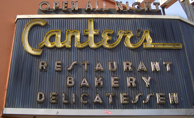
Recently I had a strange (and kind of wonderful) confluence of circumstance—combined with a smattering of coincidence and random luck. It all started right here in this blog over a year ago when I started sharing my thoughts about creating my new font Deliscript. In the posting I mentioned how the design was "loosely inspired by one of the signs at Canter’s Deli", a Los Angeles staple for almost 80 years:

At any rate my good fortune with Deliscript began about two months ago when I learned that it been selected by the Type Directors Club in NYC for inclusion in their annual show. About a month later I got a call from Bonnie Bloomgarden, the great-granddaughter of Ben Canter—one of the original Canter Bros. She and her sister Dena were trying to do a few things to gently update the Deli, while still respecting its heritage. One of their ideas was to create a "Canter's Truck" and take advantage of the recent mobile gourmet food trucks craze. A lot of the newer trucks have been completely "wrapped" with colorful graphics using fairly new printing technology.

She told me that they had started looking for fonts to design the wrap for the truck themselves, but then realized it might be a little difficult for them without having a lot of graphic design experience. Then fortune smiled on Bonnie and Dena when they did a web search Googling "Deli" and "Font" and ran smack into Deliscript (probably because of the Canter's mention in this blog) and then in turn found, and contacted me.

It has been a real pleasure working with Bonnie, a young person with good entrepreneurial instincts that are combined with a keen sense of what is worth keeping in the Canter's visual vocabulary, and what perhaps should be let go. We both concurred that the truck identity should be based on that neon sign, and that I should use Deliscript as the starting point. I also suggested that we somehow should try to incorporate into the truck design their famous neon chef, who for years has been carrying that platter of freshly baked bread:

At first I tried to graphicallyt recreate him pretty much as he was for the side of the truck. I soon realized that my rendition seemed far too literal for the look I was going for. Then, in an old matchbook catalog, I found a cut of a little round chef carrying a platter of turkey, and decided to use that as the basis for creating my updated baker (a little slimmed down) for the door of the truck:

In "Art Imitates Life...Imitates Art #2" I'll discuss how we created the design for the truck.

Share

Share

The Return of . . . KISS (#2)

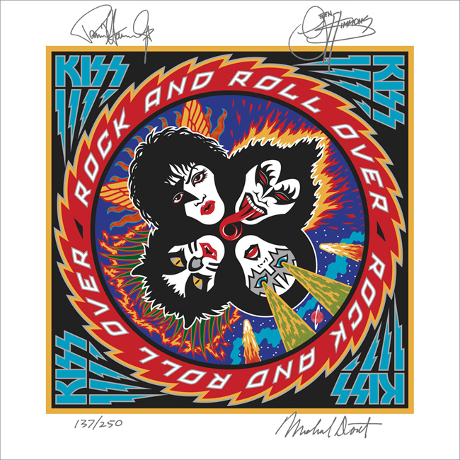
When Paul Stanley came by my studio to discuss how to proceed on the art for the cover of their upcoming CD/DVD package "Sonic Boom", I had no idea what to expect. I hadn't met with him since working on Rock and Roll Over, and had very little memory of what that had been like. Any anxiety I had melted away when we started talking. Paul is a "gentlemen's gentleman" and I immediately felt at ease talking with him—as if all those years had not intervened since the last time we had spoken. After some small talk he explained what he was after with the new cover art. His vision for this album was to make it as vital and raw as it had been when they did RaRO. He felt that that had been some of the best work that they had ever done, and wanted the new album to recreate that energy both musically and visually. While he didn't want me to reprise what I had done with my art for the earlier cover, he did want me to try to capture some of the same spirit, attitude, energy, and look that I had instilled in that piece. Also one of his stipulations was that unlike RaRO (where I had created abstract, graphic versions of the KISS personas) this time he wanted photographic representations of the four group members in full makeup. When I did RaRO I had a 12" canvas to work on. Now with CD covers and digital booklets that canvas had been reduced to less than 40% of its original size. Designing in a 4¾" space poses some very different problems from what I faced while working on covers for vinyl releases. In fact the older cover design would not have worked at that size, it's many elements would have felt crowded into a small space. So the elements of Sonic Boom had to be bigger, bolder—and fewer. I made the decision to make the title the main focus of the graphics, moving the other elements (faces, KISS logo) into prominent—but subordinate—roles.

So I set about putting pencil to paper and trying to solve this the way I solve any other design problem. I did not want to get psyched-out by thinking too much about how the new design would compare with RaRO. That cover had taken on a life of its own and had become a pop culture icon. Creating an iconic cover could not have been one of my goals. All I was capable of doing was to try to create the most compelling graphics possible within the parameters and limitations that had been set out for me. So I started out at the core of this design by creating what I call a "word constellation" out of the title. I tried to make it communicate its meaning visually by not only making it angular and "explosive", but also by creating a shape that was somewhat suggestive of flight—a "flying wing", if you will. Bearing in mind the symmetrical, mandala-like layout of RaRO I started designing the new piece as a field growing out of the center of the square, with the four members faces moving outwards from the center, and capped with my version of the ubiquitous KISS logo.

It took about a week for me to develop my sketch to the point where I felt confident in what I had come up with. As I had done with RaRO, I felt so strongly about this cover design that I decided to not present any other options—I wanted this to be the ONE.

This is the rough pencil I first presented to Paul. I held my breath as he first took it in, and then was able to exhale when I saw a big smile appear on his face.

Next: A few changes and the final art.

Share

Share

The Return of . . . KISS (#1)

I've been waiting a few months to be able to talk about this—and I have talked about it to some degree in a few online interviews, but not really in any detail. Back in April of this year I received a telephone call from out of the blue—from somewhere in South America. At the other end of the line was KISS' Paul Stanley. It'd been more years than I cared to remember since we last spoke. That was when I had done the cover art for "Rock and Roll Over"—KISS' 5th album and their 2nd to go Platinum. So you can understand my surprise when Paul asked if I'd be interested in designing the cover art for KISS' first studio album in 11 years—which Paul himself was producing.

That's when I started remembering how exciting it was the first time around, to have been involved in that fast-paced world of entertainment and music. For me it had been a far cry from doing the corporate logos, magazine and book covers I had been working on at the time. An "edgy" job for me then was doing a spread for High Times (yep, they've been around for a while)! I've always enjoyed the fact that doing what I do has enabled me to straddle many different design worlds, from the fairly straight to the totally off-the-wall. I always tried to say "yes" to just about anyone who was adventurous enough, and had the vision to see how having me design for them could work to their advantage. At any rate I had said "yes"to KISS the first time around (even though I had no idea what I was doing), so of course I again said yes to Paul. We agreed to meet when he returned at the conclusion of their South American tour.

Much to my surprise the "Rock and Roll Over" cover had in recent years become one of the most—if not the most—talked about piece of art in my portfolio. It was a little bewildering to me how over the years that cover had become an icon for this iconic group. I've been contacted by more people about my KISS artwork in the past 6 or 7 years than in all the years prior, and more than any other piece I've ever done including the New York Knicks logo. So the expectations for this new art I was to work on were quite high.

Next: the new cover design revealed.

Share

Share

Label Treatment: “Eschatone Records”

An interesting job I did recently was for a new client in Brooklyn. I designed a record label for the independent record company “Eschatone Records” who've started producing old-style vinyl records. This was the type of project that I never thought I’d get to see—but the surprising new found popularity of vinyl has given this genre a new lease on life. One of the owners of the company, Jed Davis, is a big fan of record labels from vinyl’s heyday, so I had a lot of fun giving this job some of the style I remembered from the 45 RPM labels I collected as a kid. A local art space Zakka Corp. in Brooklyn is hosting an exhibition of Eschatone's album art beginning May 23, 2008.

Share