Viewing entries tagged
Michael Doret

Share

Steinweiss on Steinweiss

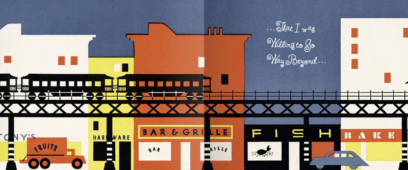
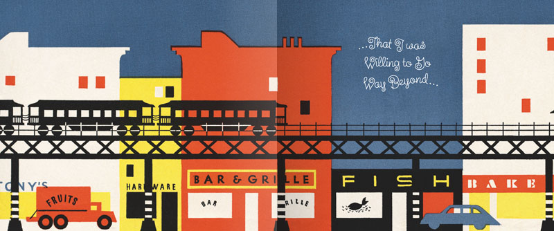
When I originally did the title lettering for "Alex Steinweiss: The Inventor of the Modern Album Cover" I hadn't yet designed "Steinweiss Script". In fact it was designing this headline that spurred me to do that typeface design. In retrospect there were many interior headlines and other lines of copy for the book that Josh Baker, AD at Taschen, would have liked to have had set in a new Steinweiss Script font. But they had to settle for what was available at that time, which was one of several different digitized versions of what Alex Steinweiss had originally designed for Photo-Lettering. Now Taschen has released their more moderately priced trade edition of this incredible book—and just in time for this release I was able to reset all their headlines and other copy the way we had originally wanted to—in Steinweiss Script:

Above: Before and After Details from the older and newer editions

Below: You can Look Inside the earlier edition...

...or Look Inside the newer version:

Our intention was that the newer version, with everything reset in Steinweiss Script, would feel closer to what Mr. Steinweiss would have done had he been able to apply his scrawl to these pages.

Just a reminder: Steinweiss Script is available for purchase on MyFonts, Veer, FontShop and YouWorkForThem. To learn more about these fonts, read Steven Heller's Imprint article or MyFonts' Creative Characters for January.

Share

Share

It Began in NoHo: Thank You Art Institute!

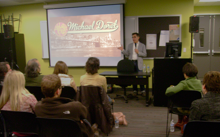
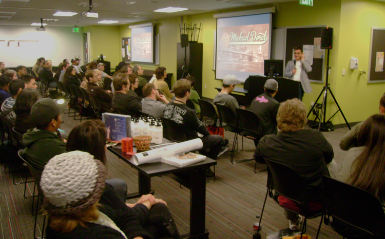
Last Friday I gave a talk to a capacity crowd at Art Institute of California – Hollywood. A big "THANK YOU" goes out to John Judy, the Academic Director of Graphic Design and Foundation Studies who planned the evening, and set it all up. I tailored my hour-long talk "It Began In Brooklyn" to what I expected would be a mostly student crowd, but many professionals showed up as well. The school opened up their space to a triple–wide room with three screens and three projectors—an unexpected layout which actually worked quite well. Afterwards we had a Q&A where I tried to answer some great questions from students and professionals. We then raffled off a Wacom tablet, a 1 year subscription to Lynda.com, several signed event posters and a CD of the complete Alphabet Soup Font Collection. I must say that it was really gratifying to see the high interest level displayed by many of the students. All in all it was a great evening. I hope everyone enjoyed it as much as I did! Below, a few photos taken by John Judy after the talk.

Share

Share

"It Began in Brooklyn"................................. A Talk at The Art Institute of California

I've been invited by The Art Institute of California–Hollywood to give a talk – it's coming up on March 4th. Here, culled from the copy of the invite, a description of what I'll be discussing:

"Michael will delve into his past and share with the audience the primal sources for the sensibilities that drive his art, and how he came to do what he does. With graphic examples Michael will discuss how he discovered that his environment and surroundings while growing up made deep and lasting impressions in his young mind that are still blatantly reflected in the samples of work he’ll be showing from various stages in his career." Basically, it's a talk about inspiration, and how we're all surrounded things that may inspire us, even if we're not completely aware of them.

This is an open invite to all who are interested. The Art Institute is located at 5250 Lankershim Boulevard in North Hollywood.

After the talk I'll give away one CD copy of "The Alphabet Soup Font Collection" ($595 value) to one lucky attendee. There'll also be a WACOM tablet and a one year subscription to Lynda.com ($250 value) given away as well. Bring your calling cards for the raffle!

If you're thinking you'd like to attend, you can find more info and an RSVP link on my website, or on my Facebook Events page.

Share

Share

MyFonts Creative Characters Newsletter

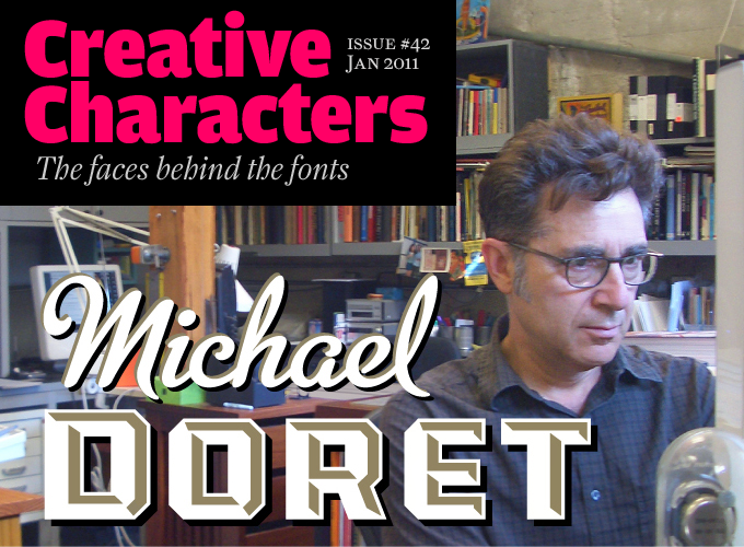
I feel very honored that MyFonts chose me as the subject of their January 2011 Creative Characters Newsletter. It took the form of an interview, and in it I've answered a lot of questions, probably at greater length than I have in the past. So if you're curious as to what makes me tick, set aside 10 or 15 minutes and read this interview. If you still have any questions, I'll entertain them here!

All you information hounds can also check out the new "Interviews & Resources" page I've just set up on my website, where I've posted other interviews, articles, PDFs, etc., that I've done in the past. Now go write that report!

Share

Share

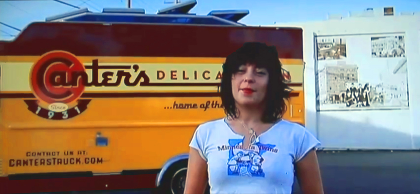
Canter's Truck Design Co-Stars with Bonnie Bloomgarden On Channel 4

http://www.youtube.com/watch?v=sirQx_KSnkI

Watch for it – it's about halfway through, and then again at the end. Ain't she a cutie...I mean the truck.

Bonnie is the great-granddaughter of Ben Canter, founder of Canter's Deli. Bonnie, along with her sister Dena, conceived the truck idea, found me, and worked together with me to come up with a great design.

To see and read more about Deliscript and the Canter's Truck design, click HERE.

Share

Share

A Second Distinction for Deliscript

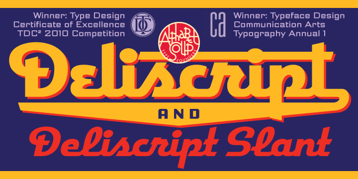
I was very pleased to learn that my Deliscript fonts in addition to having been lauded by the Type Directors Club, have also been included as winners in the Typeface Design category in Communication Arts just released Typography Annual 1.

I am also happy to have added one more reseller to the roster of type houses that sell Alphabet Soup's fonts: YouWorkForThem. They currently sell Deliscript, Metroscript and PowerStation, and I will be adding more fonts to their list soon.

Share

Share

Introducing DeLuxe Gothic — 50% Off Special!

Due to a threatened lawsuit by the folks at FontHaus (who somehow believe they are the only ones entitled to use the name "Bank Gothic") I have changed the name of my font "Bank Gothic AS" to "DeLuxe Gothic". I have great respect for the original designer of Bank Gothic, Mr. Morris Fuller Benton, and chose the name DeLuxe Gothic because it was the name that The Intertype Corporation used for their version of this classic font during the early years of the 20th Century.

My particular take on this design was that I always felt it could use a set of lowercase letters, and that is what sets my font apart from the rest. You can get a better look at it if you download the DeLuxe Gothic Brochure. Coincidental to the release of my renamed font, I've decided to run a Special Promotion on MyFonts: 50% off this font for one time only, and for a limited time—hurry and get yours before they sell out!

Share

Share

Fonts In Use: Grafika in Madrid

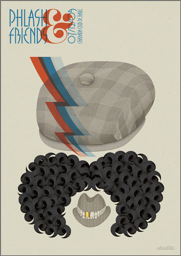
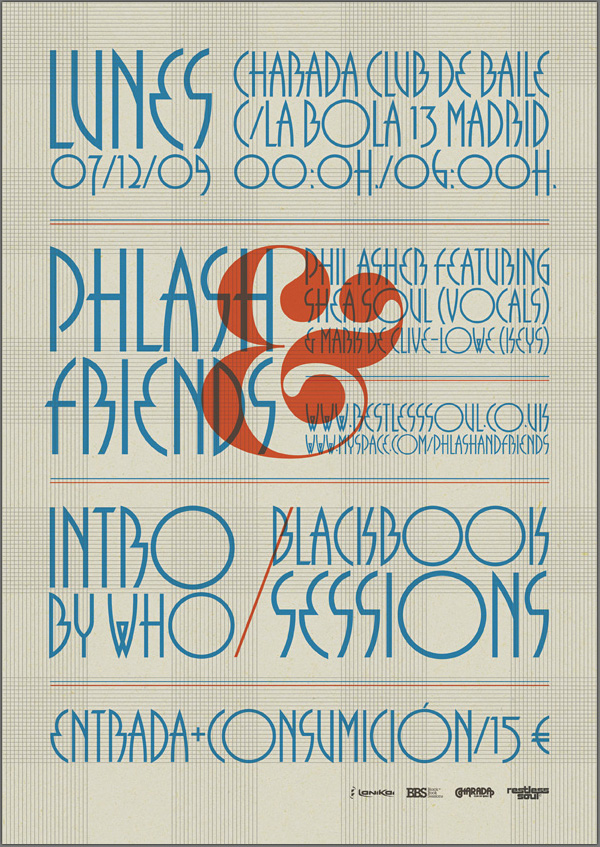
My good friend Mark Simonson recently alerted me to a very interesting use of my most recently released font Grafika. He found it Behance's online portfolio for Spanish designer Vicente García Morillo. It was used to produce a flyer for Phil Asher, a UK DJ/Producer performing in Madrid under the guise of "Phlash".

What piqued my interest about this particular usage was the fact that Mr. Morillo used Grafika in ALL CAPS—something I had never anticipated. I usually recommend that this font be set in upper and lowercase. But I have to admit that seeing this flyer has changed my mind.

Share

Share

The Return of . . . KISS (#2)

When Paul Stanley came by my studio to discuss how to proceed on the art for the cover of their upcoming CD/DVD package "Sonic Boom", I had no idea what to expect. I hadn't met with him since working on Rock and Roll Over, and had very little memory of what that had been like. Any anxiety I had melted away when we started talking. Paul is a "gentlemen's gentleman" and I immediately felt at ease talking with him—as if all those years had not intervened since the last time we had spoken. After some small talk he explained what he was after with the new cover art. His vision for this album was to make it as vital and raw as it had been when they did RaRO. He felt that that had been some of the best work that they had ever done, and wanted the new album to recreate that energy both musically and visually. While he didn't want me to reprise what I had done with my art for the earlier cover, he did want me to try to capture some of the same spirit, attitude, energy, and look that I had instilled in that piece. Also one of his stipulations was that unlike RaRO (where I had created abstract, graphic versions of the KISS personas) this time he wanted photographic representations of the four group members in full makeup. When I did RaRO I had a 12" canvas to work on. Now with CD covers and digital booklets that canvas had been reduced to less than 40% of its original size. Designing in a 4¾" space poses some very different problems from what I faced while working on covers for vinyl releases. In fact the older cover design would not have worked at that size, it's many elements would have felt crowded into a small space. So the elements of Sonic Boom had to be bigger, bolder—and fewer. I made the decision to make the title the main focus of the graphics, moving the other elements (faces, KISS logo) into prominent—but subordinate—roles.

So I set about putting pencil to paper and trying to solve this the way I solve any other design problem. I did not want to get psyched-out by thinking too much about how the new design would compare with RaRO. That cover had taken on a life of its own and had become a pop culture icon. Creating an iconic cover could not have been one of my goals. All I was capable of doing was to try to create the most compelling graphics possible within the parameters and limitations that had been set out for me. So I started out at the core of this design by creating what I call a "word constellation" out of the title. I tried to make it communicate its meaning visually by not only making it angular and "explosive", but also by creating a shape that was somewhat suggestive of flight—a "flying wing", if you will. Bearing in mind the symmetrical, mandala-like layout of RaRO I started designing the new piece as a field growing out of the center of the square, with the four members faces moving outwards from the center, and capped with my version of the ubiquitous KISS logo.

It took about a week for me to develop my sketch to the point where I felt confident in what I had come up with. As I had done with RaRO, I felt so strongly about this cover design that I decided to not present any other options—I wanted this to be the ONE.

This is the rough pencil I first presented to Paul. I held my breath as he first took it in, and then was able to exhale when I saw a big smile appear on his face.

Next: A few changes and the final art.

Share

Share

The Return of . . . KISS (#1)

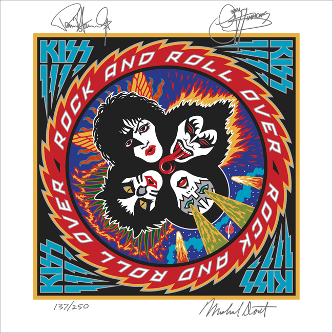
I've been waiting a few months to be able to talk about this—and I have talked about it to some degree in a few online interviews, but not really in any detail. Back in April of this year I received a telephone call from out of the blue—from somewhere in South America. At the other end of the line was KISS' Paul Stanley. It'd been more years than I cared to remember since we last spoke. That was when I had done the cover art for "Rock and Roll Over"—KISS' 5th album and their 2nd to go Platinum. So you can understand my surprise when Paul asked if I'd be interested in designing the cover art for KISS' first studio album in 11 years—which Paul himself was producing.

That's when I started remembering how exciting it was the first time around, to have been involved in that fast-paced world of entertainment and music. For me it had been a far cry from doing the corporate logos, magazine and book covers I had been working on at the time. An "edgy" job for me then was doing a spread for High Times (yep, they've been around for a while)! I've always enjoyed the fact that doing what I do has enabled me to straddle many different design worlds, from the fairly straight to the totally off-the-wall. I always tried to say "yes" to just about anyone who was adventurous enough, and had the vision to see how having me design for them could work to their advantage. At any rate I had said "yes"to KISS the first time around (even though I had no idea what I was doing), so of course I again said yes to Paul. We agreed to meet when he returned at the conclusion of their South American tour.

Much to my surprise the "Rock and Roll Over" cover had in recent years become one of the most—if not the most—talked about piece of art in my portfolio. It was a little bewildering to me how over the years that cover had become an icon for this iconic group. I've been contacted by more people about my KISS artwork in the past 6 or 7 years than in all the years prior, and more than any other piece I've ever done including the New York Knicks logo. So the expectations for this new art I was to work on were quite high.

Next: the new cover design revealed.

Share